
Collection of red wine packaging design: why are these brands red wines so popular
When it comes to red wine, we are most impressed by French red wine, Italian red wine, Spanish red wine, etc. In addition to historical factors and brand additions, red wine packaging is also the key point. The novel and conforms to the brand characteristics packaging will attract more audiences and bring more benefits. Today, I will take stock of some famous red wine packaging for you, hoping to bring some new inspiration to you.
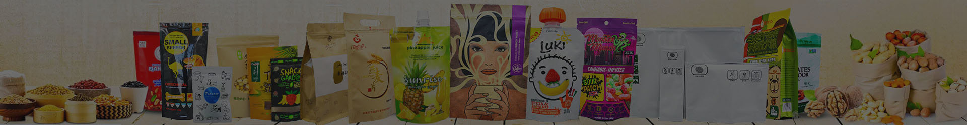
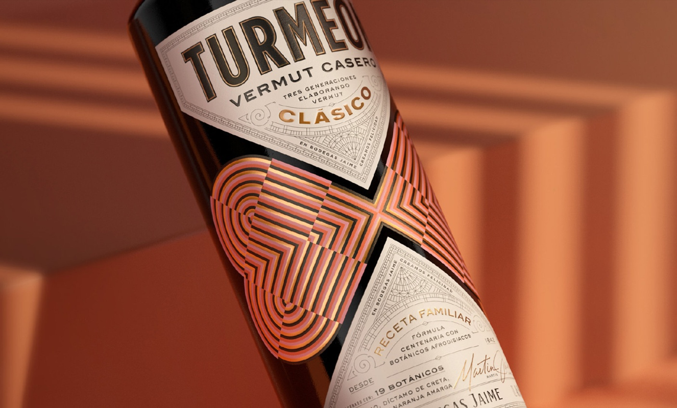
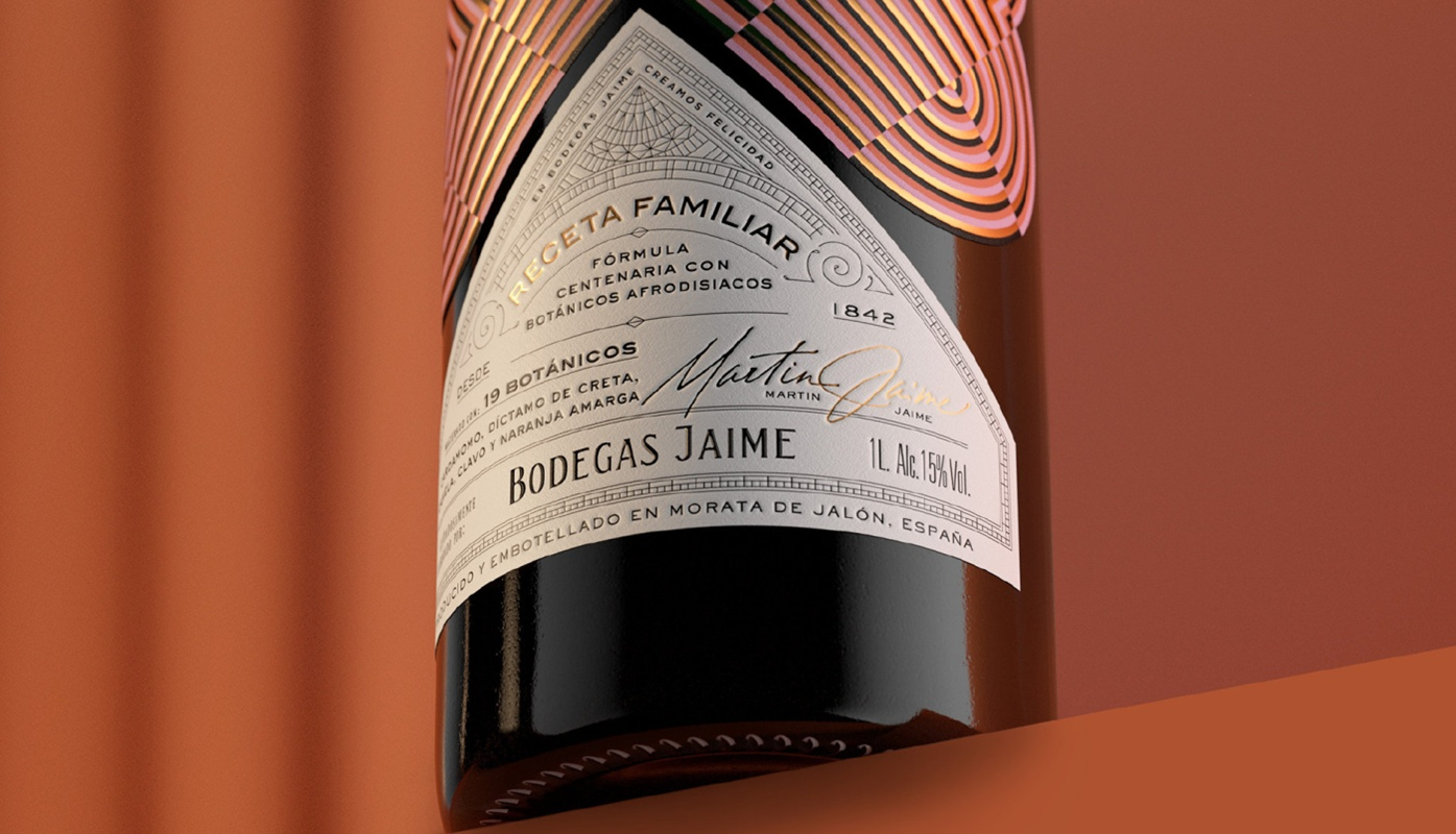
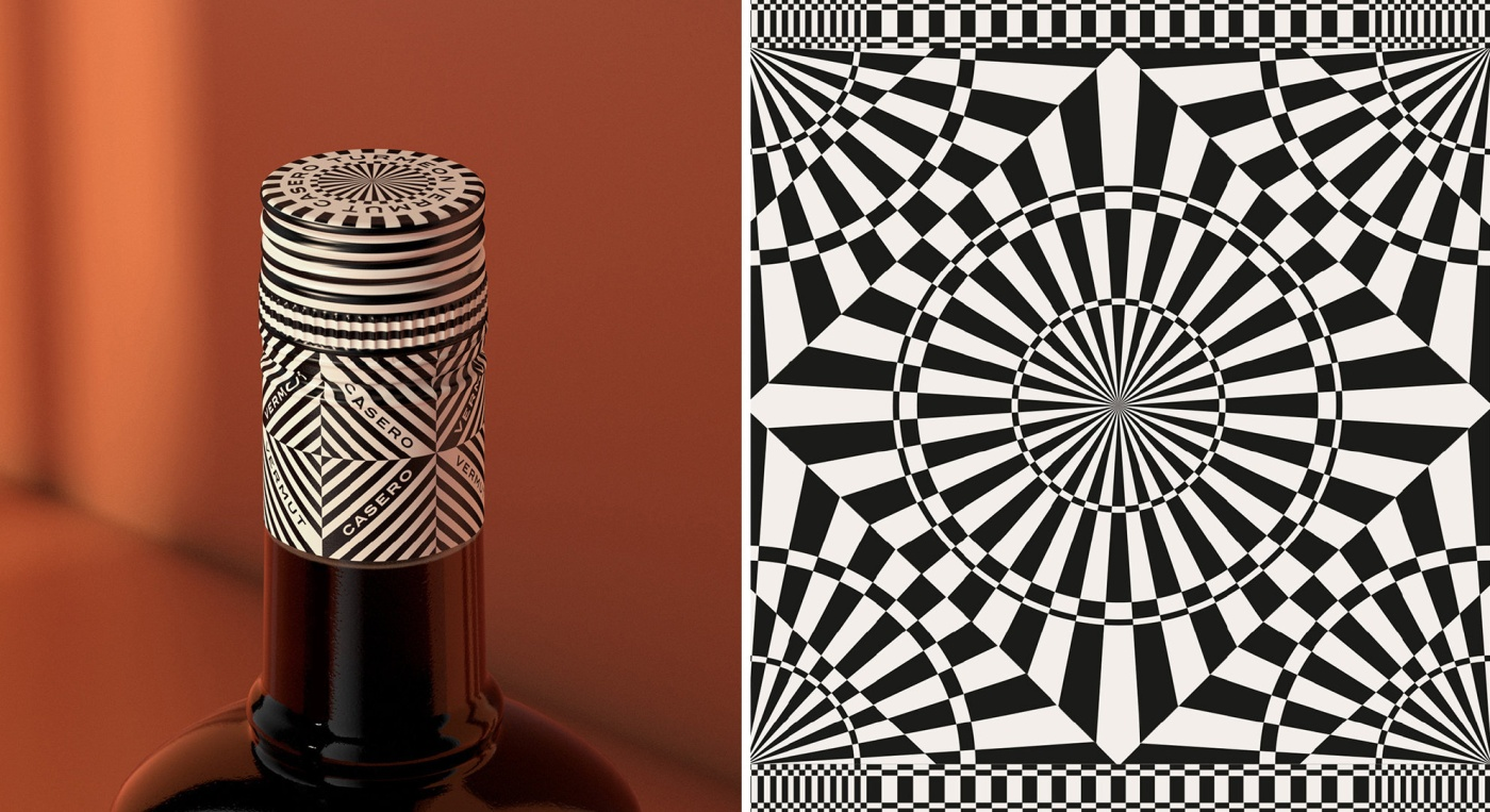
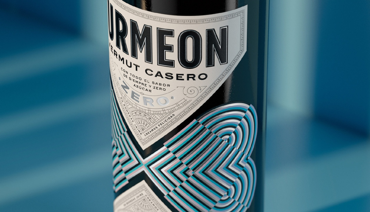
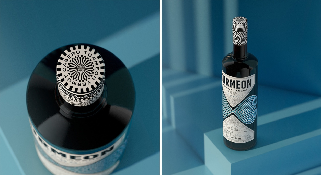
TURMEON VERMUT
Use retro and surprising colour combinations to create vibrancy while evoking an emotional connection with consumers. Colorful patterns, intricate details and foils portray the funky side of the brand, while also conveying the tone and attention to detail of the product itself.
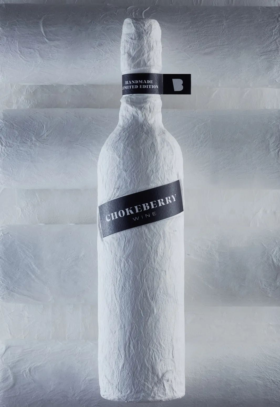
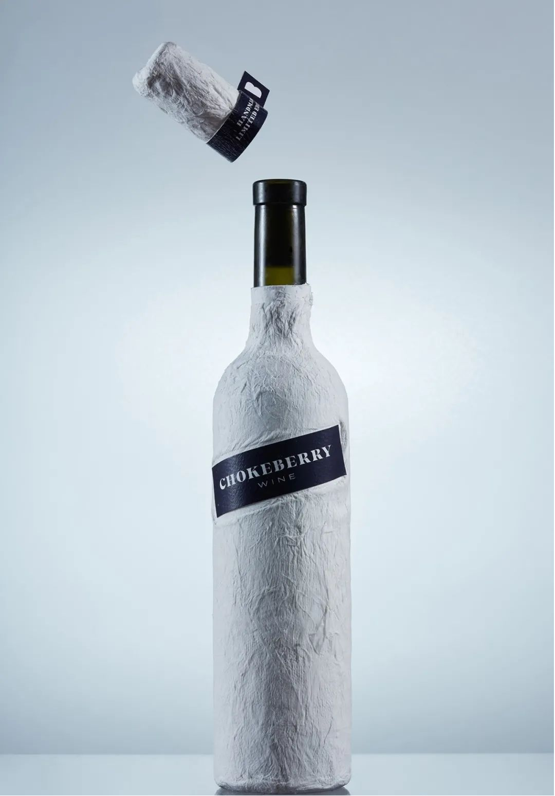
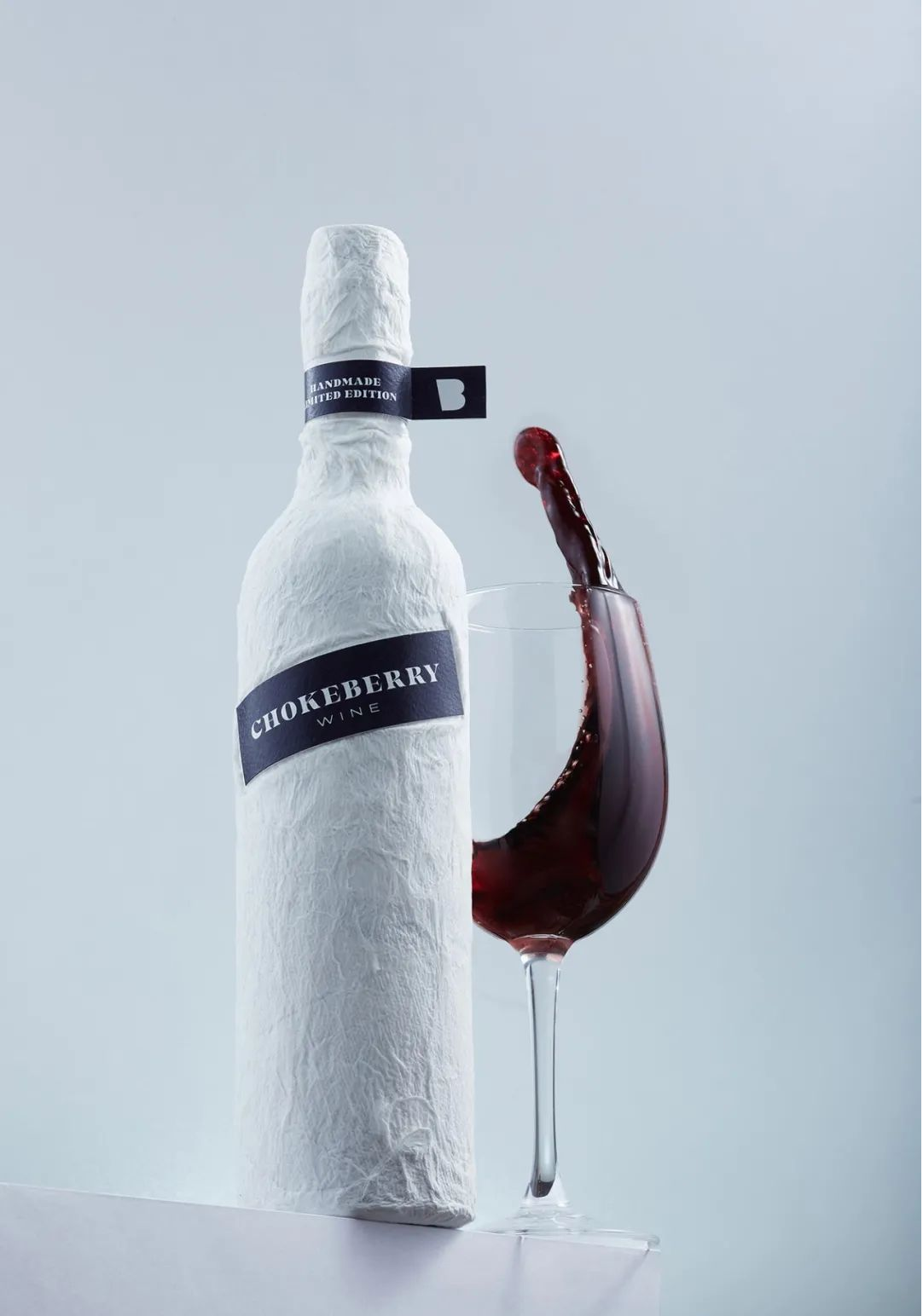
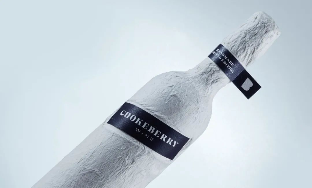
CHOKEBERRY WINE
Unique and interesting textures grab your attention, unique look helps product gets a huge added value.
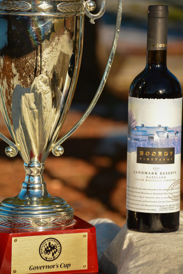
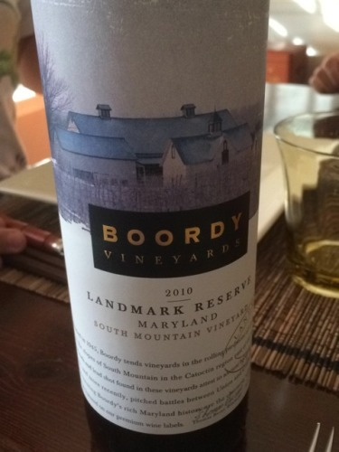
BOORDY VINEYARDS
Petit Winery’s wines are divided into three series: Landmark Series, Chesapeake Icons and Sweetland Cellars. Compact and concentrated, with flavours of cherry and white pepper, it shows the character of Cabernet Franc and is impeccably balanced.
By creating a contemporary, single-weight style architectural illustration. The painting emphasizes the mug that has become the brand's signature. Illustrations are foil stamped and colour coded to reflect the colour of the wine.
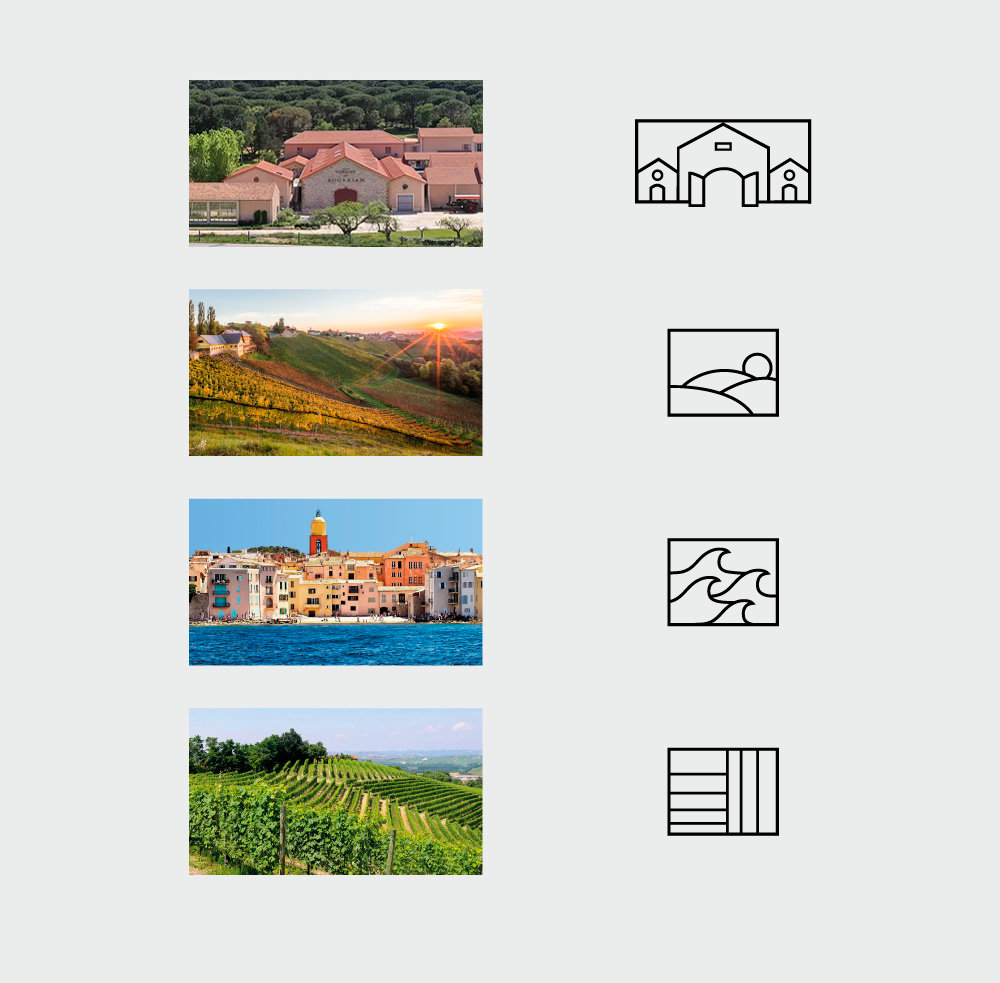
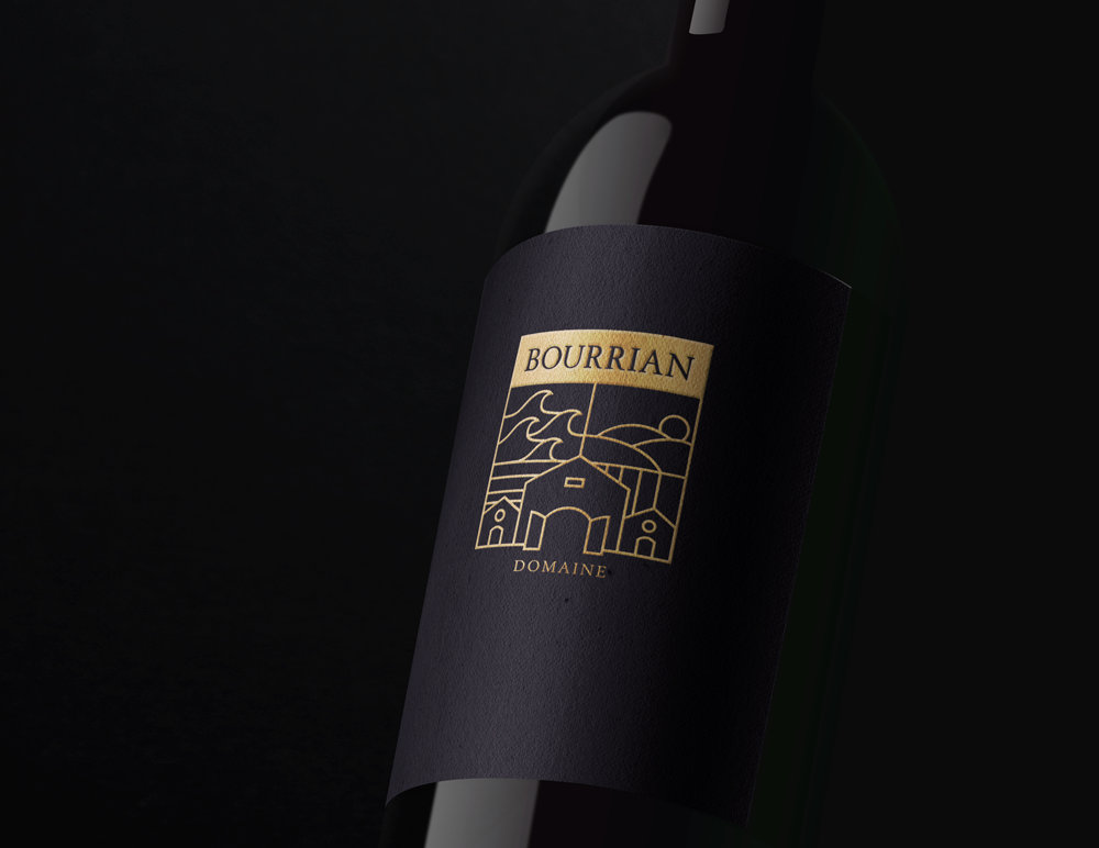
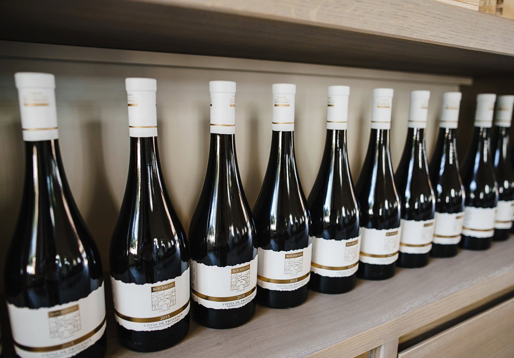
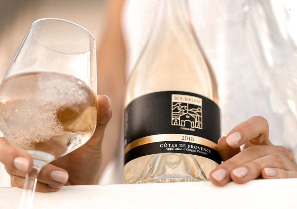
DOMAINE DU BOURRIAN
The sea, the lines of the vineyards, the territories, the hills ,all these factors represent an intuitive synthesis, supported by an in-depth analysis of the context.

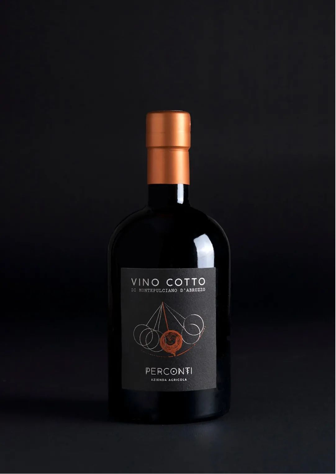
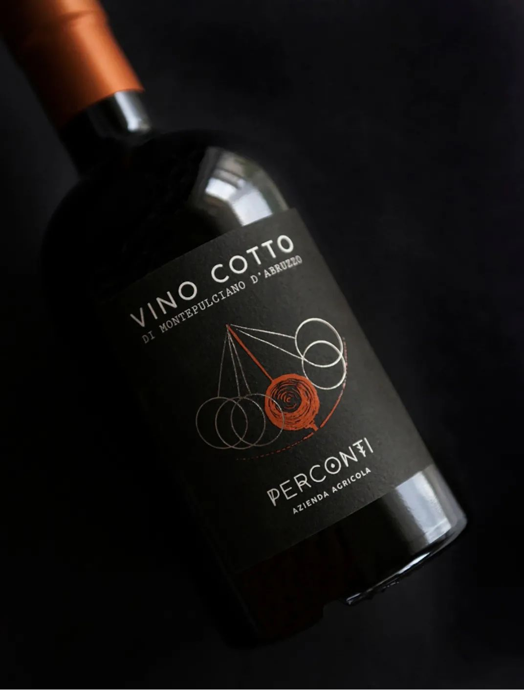
Vino Cotto
An eternal pendulum in constant motion that can only be held in place after a long and patient wait.
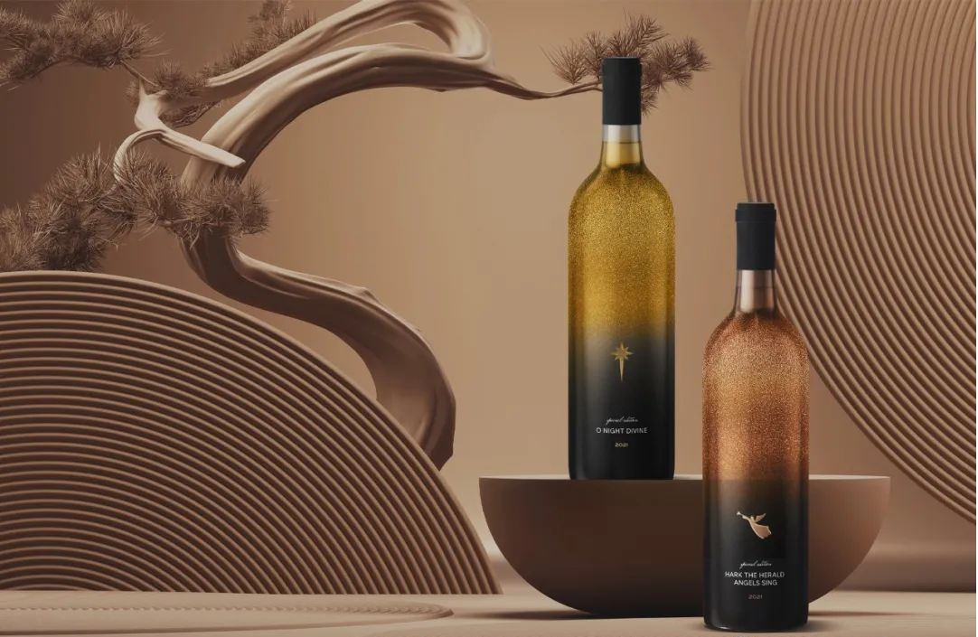
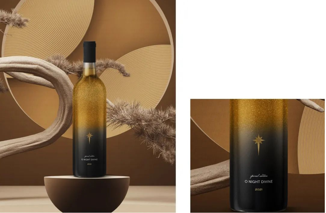
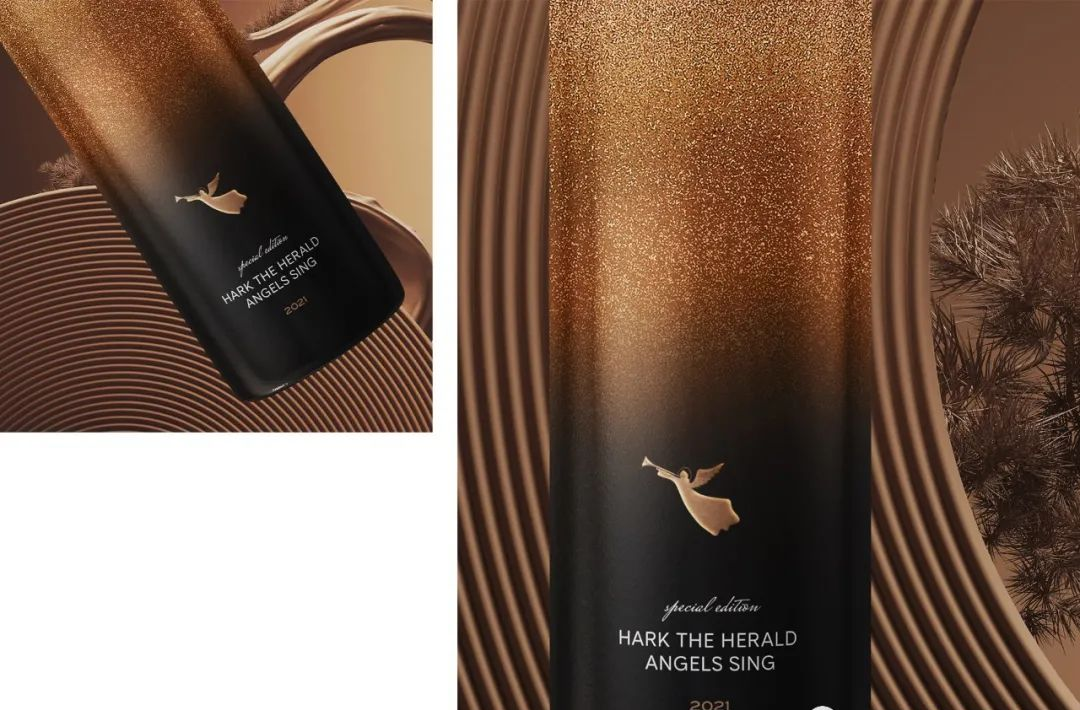
PEACE ON EARTH & POETRY CHRISTMAS
Inspired by Christmas stories. When the stars and angels became one of the icons in the nativity story. And the presence of angels, who brought good news to the people and welcomed the birth of the Prince of Peace. The design is simple, clean, but still timeless. The use of gold and black makes fine wines more elegant and luxurious.
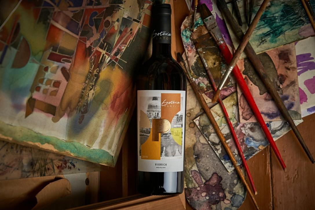
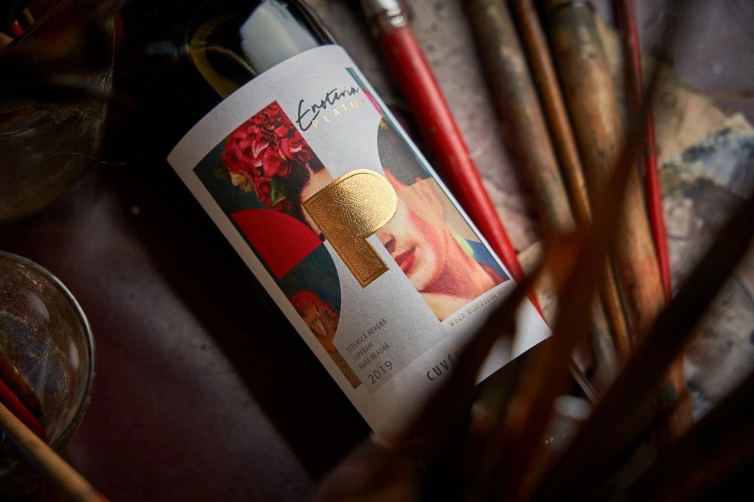
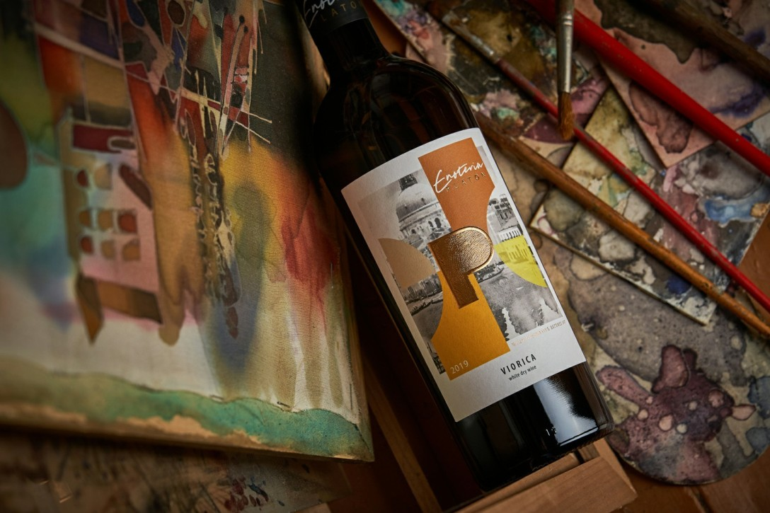
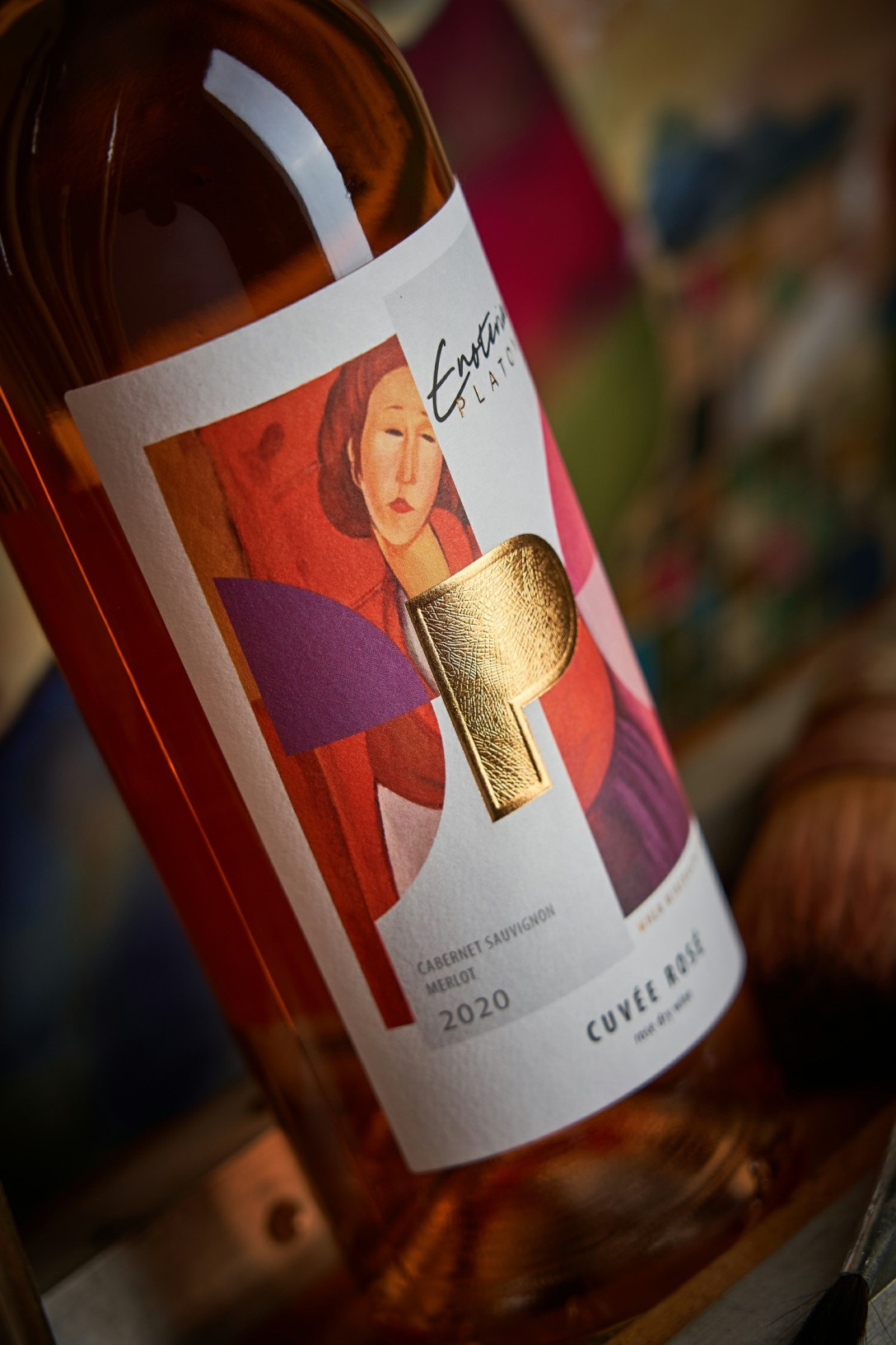
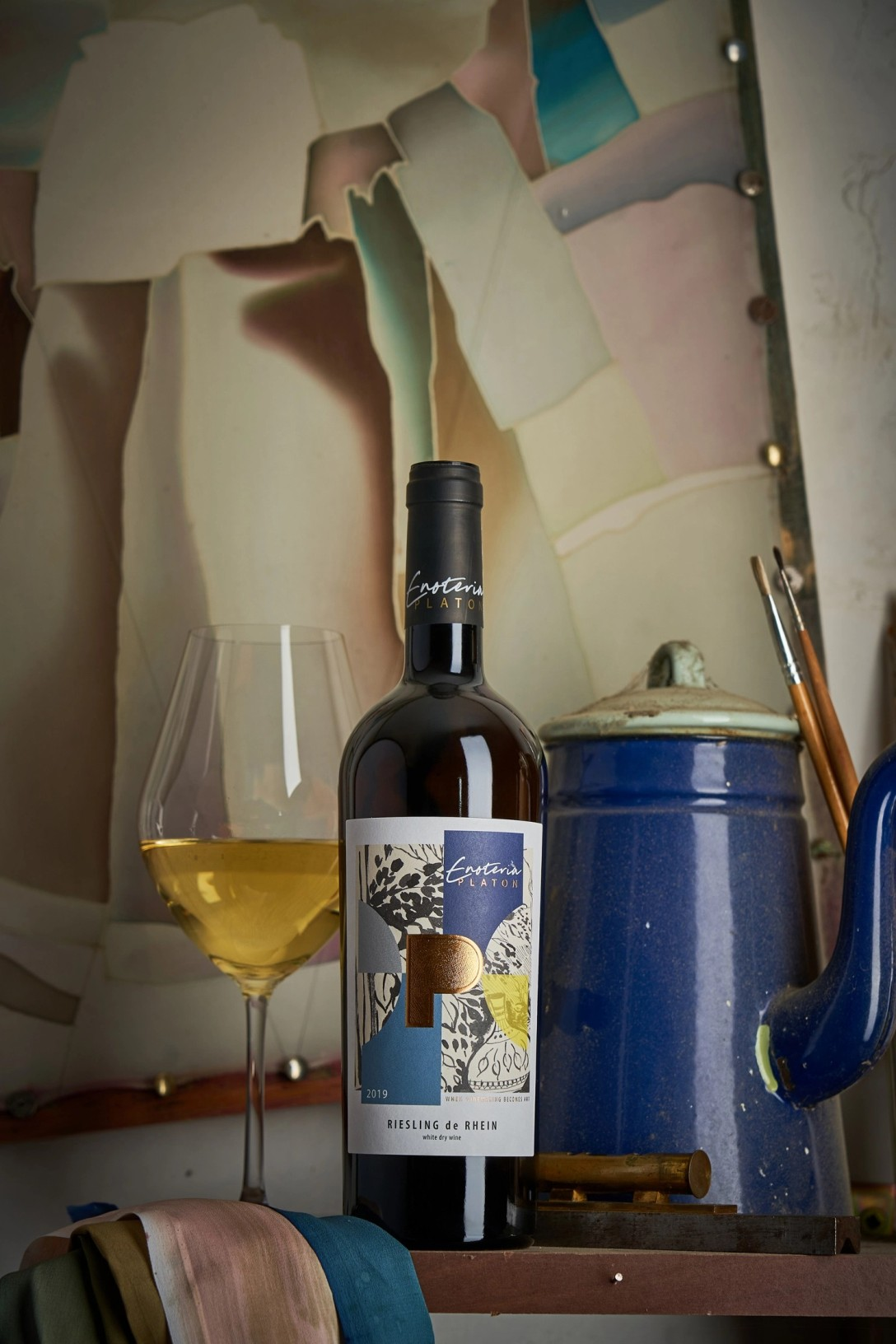
ENOTERIA PLATON
Drawing styles from completely different artists and eras were used as design elements, resulting in a unique composition. The central element of all labels is a capital P, denoting the name of winemaker Platton, and is executed using gold foil stamping and 3D embossing techniques.
Post time: Mar-18-2022